Seaborn is an amazing data visualization library for statistical graphics plotting in Python. It provides beautiful default styles and colour palettes to make statistical plots more attractive. It is built on the top of the matplotlib library and also closely integrated to the data structures from pandas. In this tutorial, we shall see how to use seaborn to make a variety of plots and how we can use it along with matplotlib to make our plots more attractive.
Installing Seaborn and getting started
Before using Seaborn, we need to install it and here I am going to show various ways of installing it on your computer.
Using Pip Installer
pip is a de facto standard package-management system used to install and manage software packages written in Python.
pip install seaborn
Using Anaconda
Anaconda is a package manager, an environment manager, and Python distribution that contains a collection of many open source packages. If you need additional packages after installing Anaconda, you can use Anaconda’s package manager or conda to install those packages.
conda install seaborn
You can also install the development version of Seaborn directly from GitHub by using this command in the command prompt.
pip install git+https://github.com/mwaskom/seaborn.git#egg=seaborn
Also, make sure you have the following dependencies installed on your computer:
- Python 3.6+
- NumPy
- SciPy
- Pandas
- Matplotlib
- Statsmodels(optional,but recommended)
Check out python seaborn courses to understand more about seaborn.
Load Data To Construct Seaborn Plots
In this section, we are going to see how to import in-built datasets from seaborn that are automatically downloaded at the time of installation. You can also use Pandas to import any dataset but using in-built datasets can come really handy when practising Seaborn. Here is how we can get a list of all datasets that are in-built in Seaborn
import pandas
import matplotlib
import scipy
import seaborn as sns
print(sns.get_dataset_names())
Output:
['anagrams', 'anscombe', 'attention', 'brain_networks',
 'car_crashes', 'diamonds', 'dots', 'exercise', 'flights',
 'fmri', 'gammas', 'geyser', 'iris', 'mpg', 'penguins',
 'planets', 'tips', 'titanic']
Now let us import any one of those datasets and visualize the data in the coming sections
import seaborn as sns
df = sns.load_dataset('car_crashes')
print(df.head())
Output:
  total  speeding  alcohol  ...  ins_premium  ins_losses  abbrev
0   18.8     7.332    5.640  ...       784.55      145.08      AL
1   18.1     7.421    4.525  ...      1053.48      133.93      AK
2   18.6     6.510    5.208  ...       899.47      110.35      AZ
3   22.4     4.032    5.824  ...       827.34      142.39      AR
4   12.0     4.200    3.360  ...       878.41      165.63      CA
Styling and Themes in Seaborn
We use visualizations to get insights from a huge amount of data or present our insights to the stakeholders and making these visualizations more pleasing can surely help with both of these. People are more likely to concentrate on beautiful and attractive visualizations rather than dull plots thus styling can be considered as a vital component of data visualization.
Matplotlib library is highly customizable, but it may be hard for us to tweak the right setting to get an attractive and good looking plot. Unlike Matplotlib, Seaborn comes packed with customized themes and a high-level interface for customizing and controlling the look of Matplotlib figures.
First, let us see how we can style a simple Matplotlib plot using Seaborn’s set() function.
from matplotlib import pyplot as plt
import seaborn as sns
plt.scatter(df.speeding,df.alcohol)
plt.show()
Output:
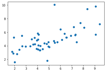
Now let us see how we can style this plot using the set() function
from matplotlib import pyplot as plt
import seaborn as sns
plt.scatter(df.speeding,df.alcohol)
sns.set()
plt.show()
Output:
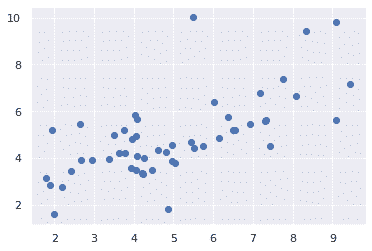
The above two figures show the difference in the default Matplotlib and Seaborn plots. The representation of data is the same, but there is a slight difference in the styling of these plots.
Seaborn supports various themes that can make styling the plots really easy and save a lot of time. Using the set_style() function of Seaborn we can set any of the themes available on Seaborn library. Here are a few of the popular themes:
- Darkgrid
- Whitegrid
- Dark
- White
- Ticks
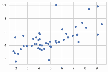
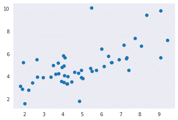
Let us try applying these themes and see how they differ from one another. The default theme of the plot will be Darkgrid which we have seen in the previous example.
from matplotlib import pyplot as plt
import seaborn as sns
plt.scatter(df.speeding,df.alcohol)
sns.set_style("whitegrid")
plt.show()
from matplotlib import pyplot as plt
import seaborn as sns
plt.scatter(df.speeding,df.alcohol)
sns.set_style("dark")
plt.show()
from matplotlib import pyplot as plt
import seaborn as sns
plt.scatter(df.speeding,df.alcohol)
sns.set_style("white")
plt.show()
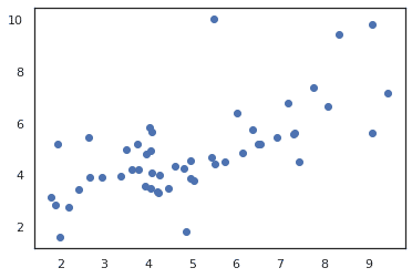
from matplotlib import pyplot as plt
import seaborn as sns
plt.scatter(df.speeding,df.alcohol)
sns.set_style("ticks")
plt.show()
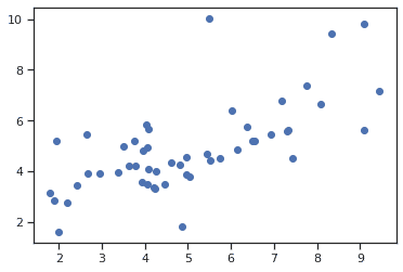
But we usually don’t make our plots as the above one as we do not include the top and right axis spines. We can remove the top and right axis spines using the despine() function.
from matplotlib import pyplot as plt
import seaborn as sns
plt.scatter(df.speeding,df.alcohol)
sns.set_style("ticks")
sns.despine()
plt.show()
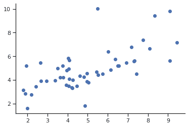
But having just a limited number of themes might not be that great as we always wish for some flexibility. Keeping this mind, these styles are customizable and can be customized by passing a dictionary of parameters to the set_style() function of Seaborn library. Parameters available are viewed using axes_style() function as shown below:
import seaborn as sns
param=sns.axes_style()
param
Output:
{'axes.axisbelow': True,
 'axes.edgecolor': '.15',
 'axes.facecolor': 'white',
 'axes.grid': False,
 'axes.labelcolor': '.15',
 'axes.spines.bottom': True,
 'axes.spines.left': True,
 'axes.spines.right': True,
 'axes.spines.top': True,
 'figure.facecolor': 'white',
 'font.family': ['sans-serif'],
 'font.sans-serif': ['Arial',
  'DejaVu Sans',
  'Liberation Sans',
  'Bitstream Vera Sans',
  'sans-serif'],
 'grid.color': '.8',
 'grid.linestyle': '-',
 'image.cmap': 'rocket',
 'lines.solid_capstyle': 'round',
 'patch.edgecolor': 'w',
 'patch.force_edgecolor': True,
 'text.color': '.15',
 'xtick.bottom': True,
 'xtick.color': '.15',
 'xtick.direction': 'out',
 'xtick.top': False,
 'ytick.color': '.15',
 'ytick.direction': 'out',
 'ytick.left': True,
 'ytick.right': False}
Changing the values of any of these parameters will alter the plot style and thus we can try various things out to make our plots really different and attractive.
from matplotlib import pyplot as plt
import seaborn as sns
plt.scatter('speeding','alcohol',data=df)
sns.set_style("darkgrid", {'grid.color': '.5'})
sns.despine()
plt.show()
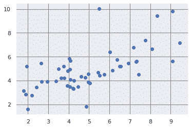
Seaborn also allows us to control individual elements of our graphs and thus we can control the scale of these elements or the plot by using the set_context() function. We have four preset templates for contexts, based on relative size, the contexts are named as follows
- Paper
- Notebook
- Talk
- Poster
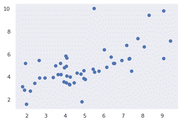
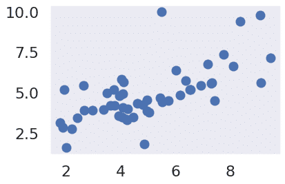
By default, context is set to notebook and all of the examples above have the context set to ‘notebook’.Now let us try any other context and see how it affects our plots.
from matplotlib import pyplot as plt
import seaborn as sns
plt.scatter(df.speeding,df.alcohol)
sns.set_style("dark")
sns.set_context("notebook")
plt.show()
from matplotlib import pyplot as plt
import seaborn as sns
plt.scatter(df.speeding,df.alcohol)
sns.set_style("dark")
sns.set_context("poster")
plt.show()
Seaborn Color Palette
Seaborn has a reputation for making plots and graphs more attractive using attractive colors and color combinations. In data visualization, color is necessarily involved, and colors have an influence on their observer.Color plays an important role than any other aspect in the visualizations. When used effectively, color adds more value to the plot. A palette means a flat surface on which a painter arranges and mixes paints. Here I’ll show some of the color palettes out of the 170 palettes offered by Seaborn.
sns.palplot(sns.color_palette("deep", 10))

sns.palplot(sns.color_palette("PiYG", 10))

sns.palplot(sns.color_palette("GnBu", 10))

Here is a list of palettes you can try out on your own.You will see a lot of use of these color palettes in the coming plots.
'Accent', 'Accent_r', 'Blues', 'Blues_r', 'BrBG',
'BrBG_r', 'BuGn', 'BuGn_r', 'BuPu', 'BuPu_r', 'CMRmap',
 'CMRmap_r', 'Dark2', 'Dark2_r', 'GnBu', 'GnBu_r',
'Greens', 'Greens_r', 'Greys', 'Greys_r', 'OrRd',
'OrRd_r', 'Oranges', 'Oranges_r', 'PRGn', 'PRGn_r',
 'Paired', 'Paired_r', 'Pastel1', 'Pastel1_r', 'Pastel2',
'Pastel2_r', 'PiYG', 'PiYG_r', 'PuBu', 'PuBuGn', 'PuBuGn_r',
'PuBu_r', 'PuOr', 'PuOr_r', 'PuRd', 'PuRd_r', 'Purples',
'Purples_r', 'RdBu', 'RdBu_r', 'RdGy', 'RdGy_r', 'RdPu',
 'RdPu_r', 'RdYlBu', 'RdYlBu_r', 'RdYlGn', 'RdYlGn_r',
 'Reds', 'Reds_r', 'Set1', 'Set1_r', 'Set2', 'Set2_r',
'Set3', 'Set3_r', 'Spectral', 'Spectral_r', 'Wistia',
 'Wistia_r', 'YlGn', 'YlGnBu', 'YlGnBu_r', 'YlGn_r',
 'YlOrBr', 'YlOrBr_r', 'YlOrRd', 'YlOrRd_r', 'afmhot',
'afmhot_r', 'autumn', 'autumn_r', 'binary', 'binary_r',
 'bone', 'bone_r', 'brg', 'brg_r', 'bwr', 'bwr_r', 'cividis',
 'cividis_r', 'cool', 'cool_r', 'coolwarm', 'coolwarm_r',
'copper', 'copper_r', 'cubehelix', 'cubehelix_r', 'flag',
'flag_r', 'gist_earth', 'gist_earth_r', 'gist_gray',
'gist_gray_r', 'gist_heat', 'gist_heat_r', 'gist_ncar',
 'gist_ncar_r', 'gist_rainbow', 'gist_rainbow_r',
'gist_stern', 'gist_stern_r', 'gist_yarg', 'gist_yarg_r',
 'gnuplot', 'gnuplot2','gnuplot2_r', 'gnuplot_r',
 'gray', 'gray_r', 'hot', 'hot_r', 'hsv',
 'hsv_r', 'icefire', 'icefire_r', 'inferno', 'inferno_r', 'jet',
'jet_r', 'magma', 'magma_r', 'mako', 'mako_r',
Seaborn’s plotting functions
In this section, we shall explore some of the wide variety of options you got when using Seaborn for plotting graphs. There are various kinds of plots that are supported in Seaborn and here we are going to explore a few of them.
Plotting with the relplot function
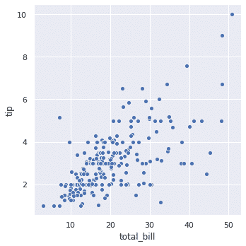
The Seaborn library provides us with relplot() function and this function provides access to several different axes-level functions that show the relationship between two variables with semantic mappings of subsets. The kind parameter selects the underlying axes-level function to use:
- scatterplot() (with kind=”scatter”)
- lineplot() (with kind=”line”)
The default value for the parameter kind is ‘scatter’ which means that by default this function would return a scatterplot. Here are a few examples of this function:
import seaborn as sns
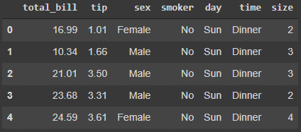
tips = sns.load_dataset("tips")
tips.head()
sns.relplot(data=tips, x="total_bill", y="tip")
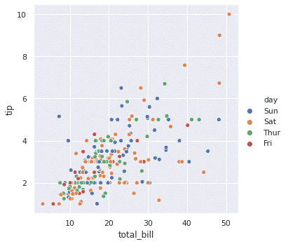
sns.relplot(data=tips, x="total_bill", y="tip", hue="day")
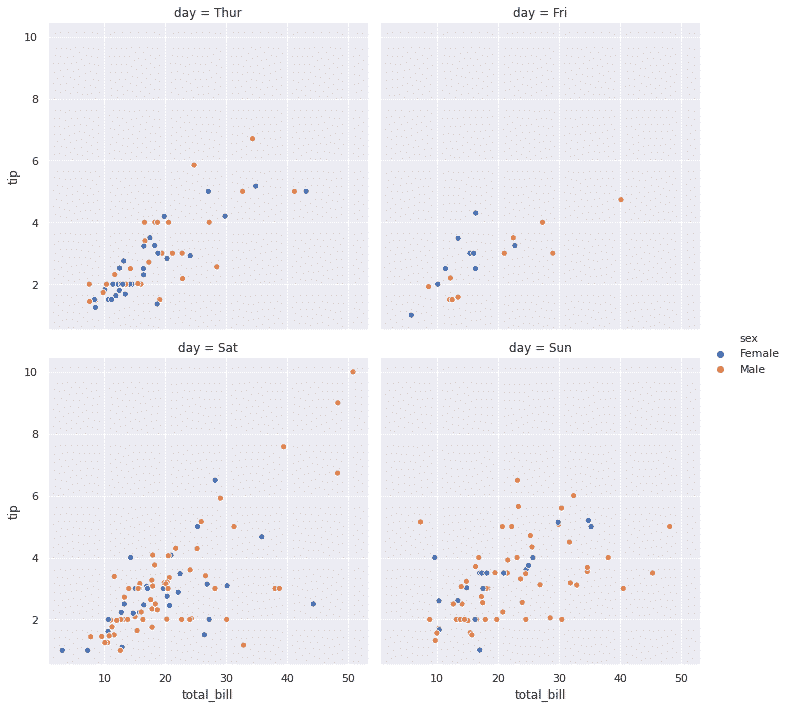
sns.relplot(data=tips, x="total_bill", y="tip", hue="sex", col="day", col_wrap=2)
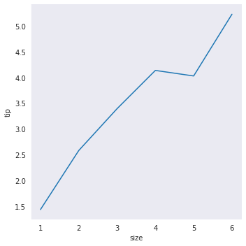
sns.relplot(data=tips, x="size", y="tip",kind="line",ci=None)
Now as you can see, we have added an extra dimension to our plot by colouring the points according to a third variable. In seaborn, this is referred to as using a “hue semantic”, because the colour of the point gains meaning and it is done by passing the third variable to the hue parameter of the relplot function. We will discuss the col parameter later in the facetGrid section.
Histogram
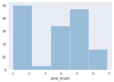
Histograms represent the data distribution by forming bins along with the range of the data and then drawing bars to show the number of observations that fall in each bin.In Seaborn we use distplot() function to plot histograms.Here is an example:
import seaborn as sns
from matplotlib import pyplot as plt
df = sns.load_dataset('iris')
sns.distplot(df['petal_length'],kde = False)
Bar Plot
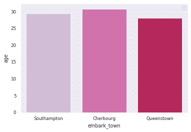
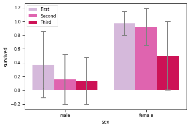
Seaborn supports many types of bar plots and you will see a few of them here. Here, as mentioned in the introduction we will use both seaborn and matplotlib together to demonstrate several plots.
Vertical barplot
The barplot plot below shows the survivors of the titanic crash based on category.
import matplotlib.pyplot as plt
import seaborn as sns

sns.set_context('paper')

# load dataset
titanic = sns.load_dataset('titanic')
# create plot
sns.barplot(x = 'embark_town', y = 'age', data = titanic,
            palette = 'PuRd',ci=None
            )
plt.legend()
plt.show()
print(titanic.columns)
import matplotlib.pyplot as plt
import seaborn as sns
# load dataset
titanic = sns.load_dataset('titanic')
# create plot
sns.barplot(x = 'sex', y = 'survived', hue = 'class', data = titanic,
            palette = 'PuRd',
            order = ['male', 'female'],
            capsize = 0.05,
            saturation = 8,
            errcolor = 'gray', errwidth = 2,
            ci = 'sd'
            )
plt.legend()
plt.show()
Horizontal barplot
To draw a horizontal plot pass ‘h’ to the parameter, orient of the barplot function as shown below:
import matplotlib.pyplot as plt
import seaborn as sns

sns.set_context('paper')
sns.barplot(x = 'age', y = 'embark_town', data = titanic,
            palette = 'PuRd', orient = 'h',
            )
plt.show()

Count plot
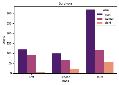
The count plot can be thought of as a histogram across a categorical variable.The example below demonstrates the count plot
import matplotlib.pyplot as plt
import seaborn as sns

sns.set_context('paper')

# load dataset
titanic = sns.load_dataset('titanic')
# create plot
sns.countplot(x = 'class', hue = 'who', data = titanic, palette = 'magma')
plt.title('Survivors')
plt.show()
Point Plot
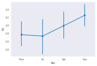
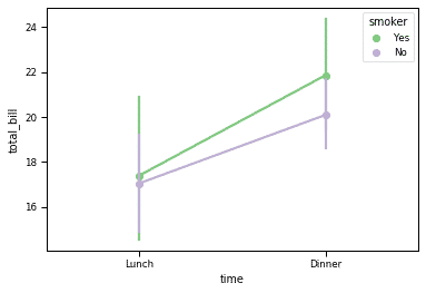
Point plot is used to show point estimates and confidence intervals using scatter plot glyphs. A point plot represents an estimate of central tendency for a numeric variable by the position of scatter plot points and provides some indication of the uncertainty around that estimate using error bars.
Point plots can be more useful than bar plots for focusing comparisons between different levels of one or more categorical variables. Here are a few examples of point plots:
# importing required packages
import seaborn as sns
import matplotlib.pyplot as plt

# loading dataset
data = sns.load_dataset("tips")
sns.pointplot(x="day", y="tip", data=data)
plt.show()
sns.pointplot(x="time", y="total_bill", hue="smoker",
                   data=data, palette="Accent")
Joint Plot
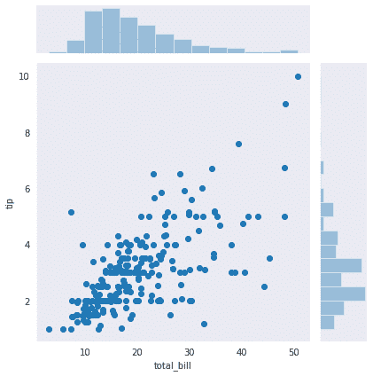
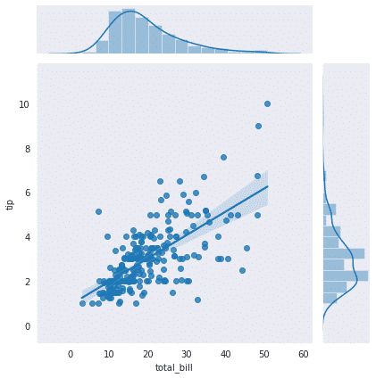
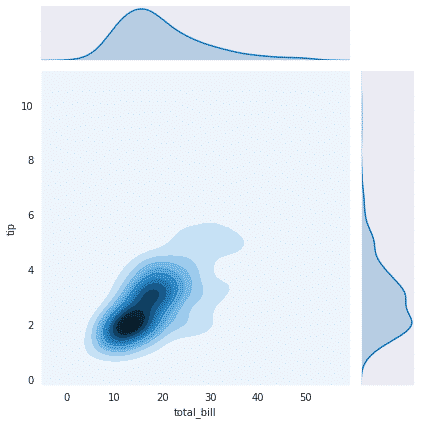
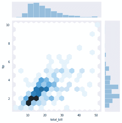
Joint Plot draws a plot of two variables with bivariate and univariate graphs. It uses the Scatter Plot and Histogram. Joint Plot can also display data using Kernel Density Estimate (KDE) and Hexagons. We can also draw a Regression Line in Scatter Plot. Here are few of the examples of a joint plot
import seaborn as sns
import matplotlib.pyplot as plt
sns.set_style("dark")
tips=sns.load_dataset('tips')
sns.jointplot(x='total_bill', y='tip',data=tips)
# Add regression line to scatter plot and kernel density estimate to histogram
sns.jointplot(x='total_bill', y='tip', data=tips, kind='reg')
# Display kernel density estimate instead of scatter plot and histogram
sns.jointplot(x='total_bill', y='tip', data=tips, kind='kde')
# Display hexagons instead of points in scatter plot
sns.jointplot(x='total_bill', y='tip', data=tips, kind='hex')
Regplot
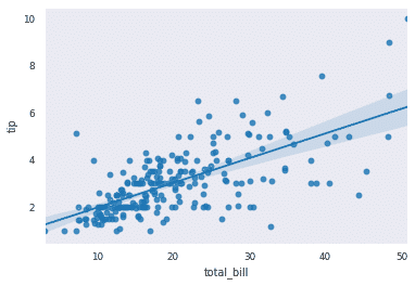
Regplot is one of the functions in Seaborn that are used to visualize the linear relationship as determined through regression. Also, you‘ll see a slightly shaded portion around the regression line which indicates how much the pints are scattered around a certain area. Here are few of the examples
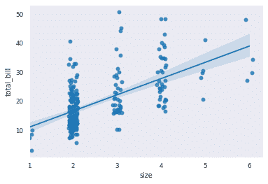
Now we will plot a discrete x variable and add some jitter. Here you can see that the areas where points are more densely populated have less shaded portion around the regression line and shaded portion is more spread where the points are more scattered.
import seaborn as sns
tips = sns.load_dataset("tips")
ax = sns.regplot(x="total_bill", y="tip", data=tips)
sns.regplot(x="size", y="total_bill", data=tips, x_jitter=0.1)
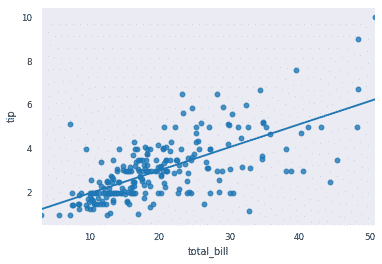
We can set the parameter ci=None to get just the line without any highlighted portion.
import seaborn as sns
tips = sns.load_dataset("tips")
ax = sns.regplot(x="total_bill", y="tip", data=tips,ci=None)
Lm Plot
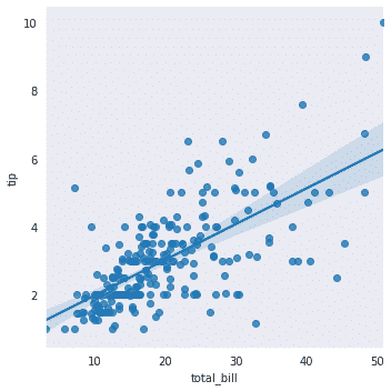
In Seaborn, we can also use lmplot instead of regplot to visualise a regression between two variables as we saw in our last example. But what is the difference between the two plots?
The regplot function performs a simple linear regression model fit and plot whereas the lmplot function combines regplot and FacetGrid.
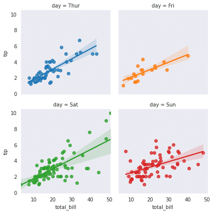
The FacetGrid class helps in visualizing the distribution of one variable as well as the relationship between multiple variables separately within subsets of your dataset using multiple panels.
It is further important to note that lmplot() is more computationally intensive and is intended as a convenient interface to fit regression models across conditional subsets of a dataset.
Here is a simple example of lmplot where it seems to work just like regplot.
import seaborn as sns
tips = sns.load_dataset("tips")
sns.lmplot(x="total_bill", y="tip", data=tips)
Here is how we can use the advance features of lmplot() and use it with multi-plot grid for plotting conditional relationships.
sns.lmplot(x="total_bill", y="tip", col="day", hue="day",
               data=tips, col_wrap=2, height=3)
KDE plot
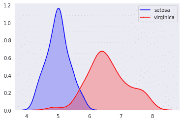
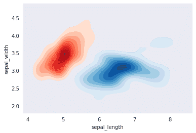
KDE plot is a Kernel Density Estimate that is used for visualizing the Probability Density of the continuous or non-parametric data variables i.e. we can plot for the univariate or multiple variables altogether. Here are few of the examples
import seaborn as sns
import matplotlib.pyplot as plt
sns.set_style("dark")
iris = sns.load_dataset("iris")
# Plotting the KDE Plot
sns.kdeplot(iris.loc[(iris['species']=='setosa'),
            'sepal_length'], color='b', shade=True, Label='setosa')
sns.kdeplot(iris.loc[(iris['species']=='virginica'),
            'sepal_length'], color='r', shade=True, Label='virginica')
# Setting up the samples
iris_setosa = iris.query("species=='setosa'")
iris_virginica = iris.query("species=='virginica'")

# Plotting the KDE Plot
sns.kdeplot(iris_setosa['sepal_length'],
            iris_setosa['sepal_width'],
            color='r', shade=True, Label='Iris_Setosa',
            cmap="Reds", shade_lowest=False)
# Plotting the KDE Plot
sns.kdeplot(iris_virginica['sepal_length'],
            iris_virginica['sepal_width'],
            color='r', shade=True, Label='iris_virginica',
            cmap="Blues", shade_lowest=False)
Box Plot
The box plot, also called the box and whisker diagram is used for depicting groups of numerical data through the quartiles. It is known as the box and whisker diagram because it is composed of a box and whiskers. Boxplot is also used for detecting the outlier in a data set.
A box plot is composed of a summary of 5 different data points: the minimum, first quartile, median, third quartile, and maximum.
- Minimum
- First Quartile or 25%
- Median (Second Quartile) or 50%
- Third Quartile or 75%
- Maximum
import seaborn as sns
tips = sns.load_dataset("tips")
sns.boxplot(x="day", y="total_bill", data=tips)
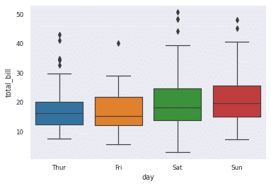
Let me briefly explain the above plot.
- The bottom black horizontal line of the box plot is the minimum value
- The first black horizontal line of the rectangle shape of the box plot is the first quartile
- or 25%
- The second black horizontal line of the rectangle shape of the box plot is Second quartile or 50% or median.
- The third black horizontal line of rectangle shape of the same box plot is third quartile or 75%
- The top black horizontal line of the rectangle shape of the box plot is the maximum value.
- The small diamond shape of the box plot is outlier data.
Violin Plot
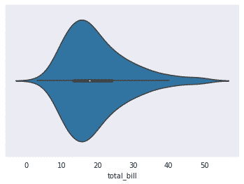
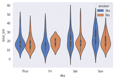
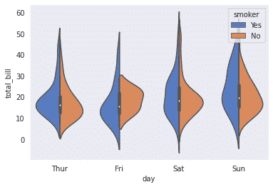
Violin plots also like boxplots summarize numeric data over a set of categories. They are essentially a box plot with a kernel density estimate (KDE) overlaid along with the range of the box and reflected to make it look nice. Unlike a box plot, in which all of the plot components correspond to actual data points, the violin plot features a kernel density estimation of the underlying distribution. Here are a few examples of violin plot:
import seaborn as sns
tips = sns.load_dataset("tips")
ax = sns.violinplot(x=tips["total_bill"])
sns.violinplot(x="day", y="total_bill", hue="smoker",
                    data=tips, palette="muted")
Now we can also represent the above plot like this by setting the parameter split as True:
sns.violinplot(x="day", y="total_bill", hue="smoker",
                    data=tips, palette="muted", split=True)
Heatmap
A heatmap is a two-dimensional graphical representation of data where the individual values that are contained in a matrix are represented as colours. In Seaborn, we can make annotated heatmaps which can be tweaked using Matplotlib as per requirement.
Now if we get the data of the dataset ‘flights’ and transform it by monthly as shown below, it can give us a lot of information about the data. But this information is in tabular form and can be better displayed by using heatmap as shown below:
flights=sns.load_dataset("flights")
flights = flights.pivot("month", "year", "passengers")
print(flights)
Output:
year       1949  1950  1951  1952  1953  ...  1956  1957  1958  1959  1960
month                                    ...
January     112   115   145   171   196  ...   284   315   340   360   417
February    118   126   150   180   196  ...   277   301   318   342   391
March       132   141   178   193   236  ...   317   356   362   406   419
April       129   135   163   181   235  ...   313   348   348   396   461
May         121   125   172   183   229  ...   318   355   363   420   472
June        135   149   178   218   243  ...   374   422   435   472   535
July        148   170   199   230   264  ...   413   465   491   548   622
August      148   170   199   242   272  ...   405   467   505   559   606
September   136   158   184   209   237  ...   355   404   404   463   508
October     119   133   162   191   211  ...   306   347   359   407   461
November    104   114   146   172   180  ...   271   305   310   362   390
December    118   140   166   194   201  ...   306   336   337   405   432
sns.heatmap(flights,linewidths=.5,cmap="YlGnBu")
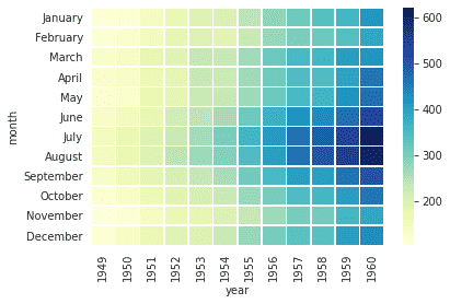
Now we can also put the respective values in the boxes using the annot parameter of this function
import seaborn as sns
car_crashes = sns.load_dataset("car_crashes")
corr=car_crashes.corr()
print(corr)
sns.heatmap(corr,annot=True,linewidths=.5,cmap="YlGnBu")
Output
                  total  speeding  ...  ins_premium  ins_losses
total           1.000000  0.611548  ...    -0.199702   -0.036011
speeding        0.611548  1.000000  ...    -0.077675   -0.065928
alcohol         0.852613  0.669719  ...    -0.170612   -0.112547
not_distracted  0.827560  0.588010  ...    -0.174856   -0.075970
no_previous     0.956179  0.571976  ...    -0.156895   -0.006359
ins_premium    -0.199702 -0.077675  ...     1.000000    0.623116
ins_losses     -0.036011 -0.065928  ...     0.623116    1.000000

Cluster map
Cluster map method plots a matrix dataset as a hierarchically-clustered heatmap. It uses hierarchical clusters to order data by similarity. This reorganizes the data for the rows and columns and displays similar content next to one another for even more depth of understanding the data.
import seaborn as sns
flights=sns.load_dataset("flights")
flights = flights.pivot("month", "year", "passengers")
sns.clustermap(flights,linewidths=.5,cmap="coolwarm")
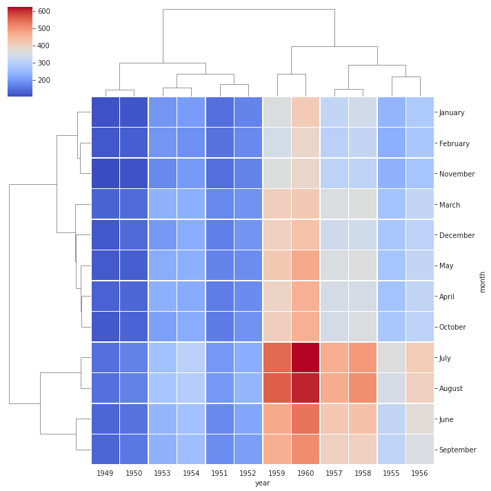
As you can see in this map all the columns and rows that have similar data together and now neither the years nor the months are in order as we saw in the heatmap. We can modify it a bit and only cluster rows or columns, here is how :
import seaborn as sns
flights=sns.load_dataset("flights")
flights = flights.pivot("month", "year", "passengers")
sns.clustermap(flights,linewidths=.5,cmap="coolwarm",col_cluster=False)
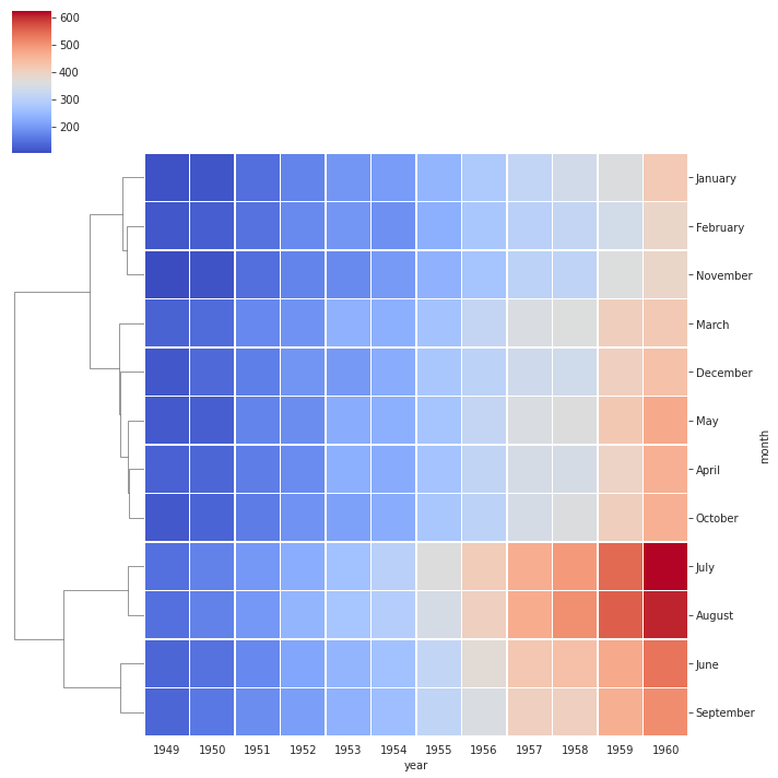
Now all the years are in order but the months are clustered and thus are not in order
Facetgrid
Facet grid forms a matrix of panels defined by row and column by dividing the variables. Due to panels, a single plot looks like multiple plots. It is very helpful to analyze all combinations in two discrete variables.
The advantage of using Facet is, we can input another variable into the plot. The above plot is divided into two plots based on a third variable called ‘diet’ using the ‘col’ parameter. We can also one more parameter “row” which can help to add one more variable to our plot. Now the plot below shows that relation between tips and total bill and also show their relation with two more variables,i.e gender and time.
import seaborn as sns
tips = sns.load_dataset("tips")
g = sns.FacetGrid(tips, col="time")
g.map(sns.scatterplot, "total_bill", "tip")

tips = sns.load_dataset("tips")
g = sns.FacetGrid(tips, col="time", row="sex")
g.map(sns.scatterplot, "total_bill", "tip")

Pair Plot
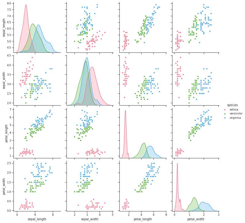
Pair plot creates a grid of Axes such that each numeric variable in data will be shared across the y-axes across a single row and the x-axes across a single column. The diagonal plots are treated differently: a univariate distribution plot is drawn to show the marginal distribution of the data in each column.
Pair Plots are a really simple way to visualize relationships between each variable. It produces a matrix of relationships between each variable in your data for an instant examination of our data as you’ll see in the example below.
import seaborn as sns
from matplotlib import pyplot as plt
df = sns.load_dataset('iris')
sns.set_style("ticks")
sns.pairplot(df,hue = 'species',diag_kind = "kde",kind = "scatter",palette = "husl")
plt.show()
This brings us to the end of this article where we covered some basics of Seaborn and learned to plot various plots. You can get a free course on Machine learning on great learning academy, click the banner below to know more.


